This image is an official menu showcase visual from Pop Chicken’s website (https://www.popchicken.com), uploaded as part of the brand’s January 2026 content library (filed under the site’s 2026/01 asset folder).
Framed as a tight, immersive close-up shot, the entire frame is dedicated exclusively to Pop Chicken’s signature crispy fried chicken—no plates, sides, or background elements distract from the dish, creating an unbroken focus on the product itself.
Visually, the chicken boasts a rich, multi-tonal golden-brown exterior: the base hue is a warm, appetizing amber, with subtle deeper brown flecks along the edges and crevices of the coating, hinting at a perfectly crisped, well-seasoned fry. The breading texture is highly detailed: it’s not a smooth layer, but a granular, slightly uneven surface with fine, crackled ridges and tiny, raised crumbs—each texture cue emphasizes a shatteringly crisp, crunchy bite. A faint, subtle sheen (not greasy, but a soft glow) lingers on parts of the coating, suggesting the chicken is freshly prepared, with just the right amount of moisture locked in beneath the crisp exterior.
The lighting is intentionally soft and warm, cast from a gentle side-front angle: it highlights the dimensionality of the breading’s texture (catching the peaks of the crumbs while softening the shadows in the crevices) without creating harsh glares, and amplifies the inviting, “ready-to-serve” warmth of the chicken’s color.
As a brand asset, the image’s purpose is clear: to position this fried chicken as Pop Chicken’s flagship menu item, leaning into tactile, visual appeal to entice website visitors and communicate the dish’s signature crunch and freshness.
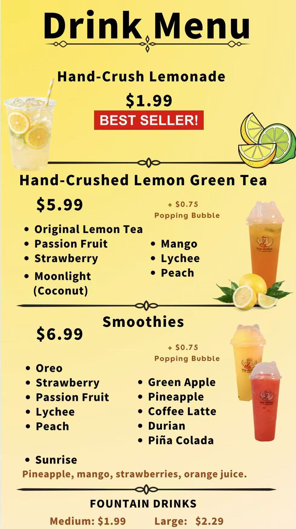
This image is an official menu visual from Pop Chicken’s website (https://www.popchicken.com), uploaded as part of the brand’s January 2026 content library (housed in the site’s 2026/01 asset folder). Designed to showcase the restaurant’s beverage offerings, the image features a clean, organized layout that balances appetizing product presentation with clear, scannable menu details—ideal for website visitors seeking drink options to pair with Pop Chicken’s signature savory items.
The frame is divided into two key sections: a prominent visual focus on the star beverages and a structured text block listing all available drinks, their prices, and special add-ons. In the visual foreground, the centerpiece is the “Hand-Crushed Lemonade”—labeled a “BEST SELLER!”—presented in a tall, clear glass filled with icy, pale yellow liquid, flecks of fresh lemon pulp visible throughout, and a bright yellow lemon slice garnish on the rim. Beside it, the “Hand-Crushed Lemon Green Tea” sits in a similar glass, its hue a vibrant, refreshing light green, also topped with ice and a subtle garnish, emphasizing its fresh, homemade quality. Nearby, a smoothie (likely one of the fruity variants like Strawberry or Mango Lychee) is displayed in a frosted glass, its texture thick and creamy with a swirled, colorful exterior that hints at ripe, blended fruit.
The background of the image is soft and neutral, with a warm, natural light that enhances the vivid colors of the beverages—making the lemonade’s brightness, the green tea’s vibrancy, and the smoothie’s richness stand out without clashing. The lighting also accentuates the icy texture of the drinks, conveying a cool, refreshing appeal perfect for complementing fried chicken.
Beneath the visual elements, the menu text is arranged in a clear, easy-to-read font. It categorizes drinks into three core groups: “Hand-Crushed” options (Lemonade and Lemon Green Tea), “Smoothies,” and “FOUNTAIN DRINKS.” Each item lists its price prominently: Hand-Crushed Lemonade at $1.99 (with the “BEST SELLER!” label in bold, eye-catching text), Hand-Crushed Lemon Green Tea at $5.99 (with a note of “+ $0.75 Popping Bubble” for customization), Smoothies at $6.99 (also offering “+ $0.75 Popping Bubble” and listing flavors like Oreo, Strawberry, Passion Fruit, Lychee Peach Sunrise, Green Apple, Pineapple, Coffee Latte, Durian, and Pina Colada), and Fountain Drinks priced at $1.99 for Medium and $2.29 for Large. Additional flavor notes are included for select items—such as “Pineapple, mango, strawberries, orange juice” for one smoothie variant—and a standalone (Coconut) option is listed under the Hand-Crushed section, adding clarity for dietary or preference-based choices.
The overall design is brand-aligned with Pop Chicken’s casual, approachable aesthetic: it’s not overly formal, but still polished, with a focus on making the drinks look desirable while ensuring menu information is accessible. The combination of appetizing visuals and structured text serves a dual purpose: to entice customers with the drinks’ freshness and variety, and to help them quickly make decisions by highlighting bestsellers, prices, and customization options. Every element—from the garnished glasses to the bold “BEST SELLER!” label—works to position these beverages as essential, refreshing companions to Pop Chicken’s main menu.
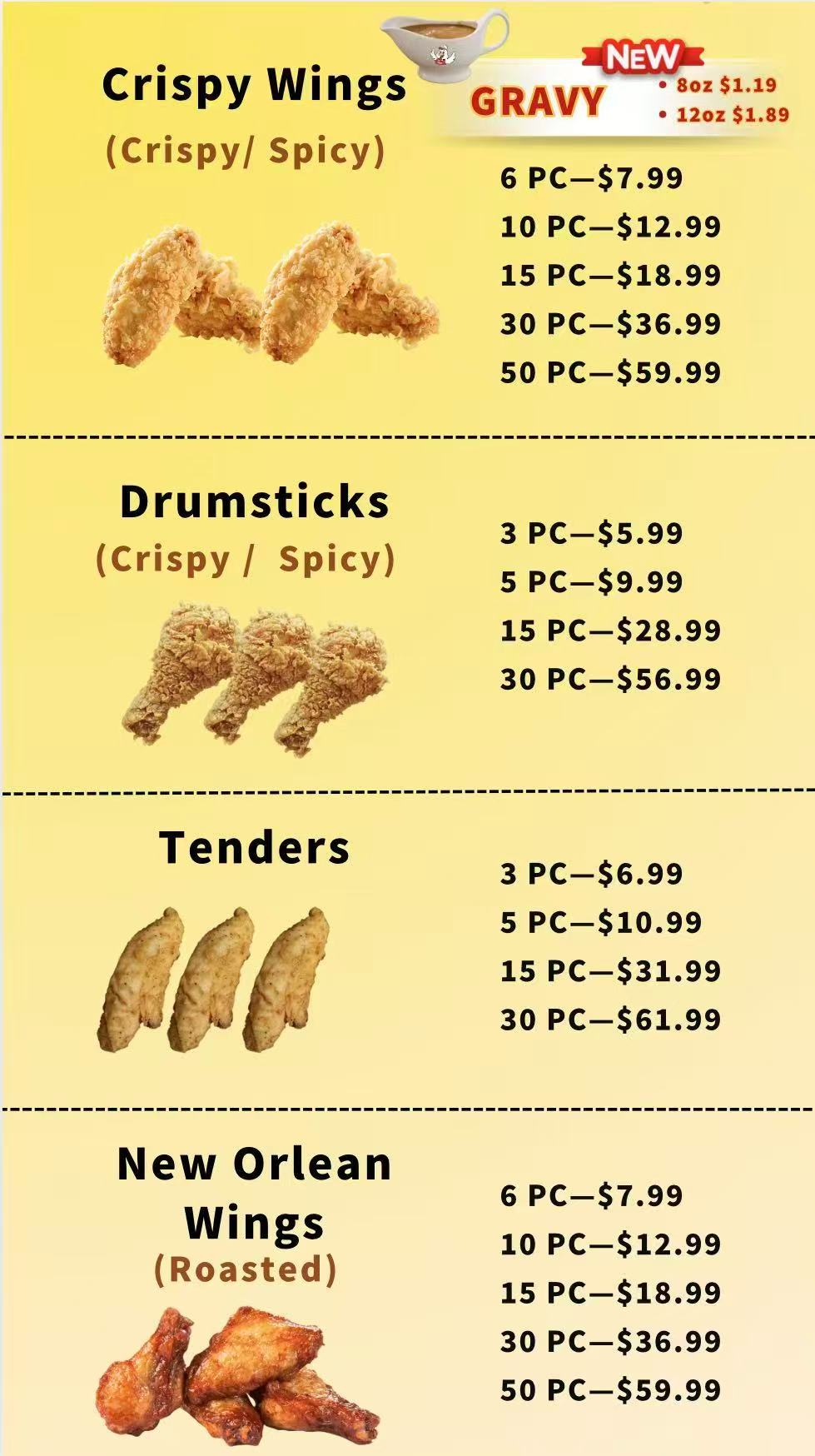
This image is an official menu board visual from Pop Chicken’s website (https://www.popchicken.com), part of the brand’s January 2026 content uploads (stored in the site’s 2026/01 asset folder). Designed to highlight the restaurant’s savory chicken-focused offerings—specifically Korean-style wings and signature sandwiches—the image features a clean, functional layout that balances clear information hierarchy with subtle visual appeal, tailored to help customers quickly navigate menu options, pricing, and customization choices.
The overall design is minimalist and easy to scan, with a neutral, soft-toned background that keeps focus on the text and any subtle product accents (no distracting graphics or busy patterns). The text is presented in a bold, legible font—primarily in dark ink against a light backdrop—ensuring readability for website visitors, whether viewing on desktop or mobile.
At the top of the menu board, the headline “Korean Wings” is prominently displayed, immediately signaling the core category. Directly beneath, a clear label reads “<Bone in/Boneless>,” highlighting the key customization option for this item. Below this, the pricing structure for Korean Wings is organized by quantity, with each size paired with sauce flavor allowances: 6 PC for $7.99 (1 Flavor), 10 PC for $12.99 (2 Flavors), 15 PC for $18.99 (2 Flavors), 30 PC for $36.99 (3 Flavors), and 50 PC for $59.99 (3 Flavors). A descriptive subheading—“Breaded Wings W/ Sauce Tossed”—clarifies the preparation method, ensuring customers understand the dish’s style.
Following the pricing, a dedicated “Flavors Options” section lists 11 distinct sauces and seasonings, each marked with a bullet point for clarity: BBQ, Garlic Parmesan, Asia BBQ, Sweet Red Chili, Honey Garlic, Korean BBQ, Soy Garlic, Mango Habanero, Lemon Pepper (Dry), and Sweet Sour. This extensive flavor range is highlighted to cater to diverse taste preferences, from sweet and savory to spicy and tangy.
Beneath the Korean Wings section, the menu shifts to signature sandwiches, with two core options listed side by side for easy comparison: “Fried Chicken Sandwich (Crispy/ Spicy)” and “Orleans Roasted Chicken Sandwich.” Both are priced identically at $5.29, with their preparation styles (crispy/spicy or roasted) clearly noted to differentiate the offerings.
At the bottom of the menu board, a mandatory food safety disclaimer is included in smaller (but still legible) text: “Ask about menu items that are cooked or served raw, consuming raw or undercooked meat, seafood, shellfish may increase your risk of foodborne illness.” This text adheres to regulatory requirements while maintaining the menu’s clean aesthetic.
Visually, the image avoids overly stylized product photography, instead prioritizing functionality—every element is designed to communicate key details (customization, pricing, flavors) efficiently. The neutral background and consistent typography keep the menu cohesive, while bold headings and clear section divisions guide the eye through the offerings. The overall tone aligns with Pop Chicken’s casual, customer-centric brand identity: approachable, transparent, and focused on helping diners make informed choices about their orders. Whether used on the brand’s website, social media, or in-store, the image serves as a practical yet inviting showcase of Pop Chicken’s popular Korean wings and signature sandwiches.
This image is an official menu board from Pop Chicken’s website (https://www.popchicken.com), part of the brand’s January 2026 content library (housed in the site’s 2026/01 asset folder). Designed explicitly for group dining—targeting families, parties, or gatherings—it focuses on shareable value packs (Family Meals & Party Packs) and features a highly organized, scannable layout that prioritizes clarity, pricing transparency, and ease of decision-making for customers ordering in bulk.
The overall aesthetic is minimalist and functional, aligned with Pop Chicken’s casual, customer-centric brand identity: a soft, neutral background (free of distracting graphics or busy patterns) keeps full attention on the menu’s text and category divisions, while bold, high-contrast typography ensures readability across devices (desktop, mobile, or in-store displays). The menu is structured into three distinct, easy-to-navigate sections—each dedicated to a core shareable offering—with clear headings and consistent formatting to guide the eye seamlessly.
At the top of the menu, the first section is labeled with a prominent, bold heading: “Chicken (Bone in / Boneless)”, immediately signaling the base option for customers seeking classic fried chicken in bulk. Below the heading, the pricing and quantity structure is laid out in a straightforward, list-style format, with each size paired with a clear price point, designed to cater to different group sizes:
- 10 PC: $14.99
- 15 PC: $21.99
- 30 PC: $42.99
- 50 PC: $69.99
The inclusion of “(Bone in / Boneless)” in the section title eliminates ambiguity, letting customers know they can customize their order to preference without extra fine print— a key detail for convenience-focused group orders.
The middle section focuses on Pop Chicken’s popular Korean-style wings, with a bold heading: “Korean Wings”. Mirroring the quantity structure of the chicken packs (for consistency and ease of comparison), the pricing here is:
- 10 PC: $15.99
- 30 PC: $45.99
- 50 PC: $74.99
This section builds on the brand’s existing Korean wing offering (featured in previous menu boards) by scaling it for sharing, appealing to groups that prefer sauce-tossed, flavor-forward wings over traditional fried chicken. The slightly higher price point than the classic chicken packs reflects the specialized sauce and preparation method, while the consistent quantity tiers (10/30/50 PC) keep the menu intuitive.
The third and final section caters to groups with diverse tastes, labeled “Mixed (Chicken + Wings)”—a hybrid option that combines classic chicken and Korean wings. This section is particularly strategic for flexibility, as it eliminates the need for customers to order two separate packs. The quantity and pricing structure here matches the previous sections, maintaining uniformity:
- 10 PC: $15.99 (split evenly between chicken and wings, implied by the “mixed” label)
- 15 PC: $23.99
- 30 PC: $44.99
- 50 PC: $72.99
At the bottom of the menu board, a mandatory food safety disclaimer is included in smaller (but still legible) text, consistent with regulatory requirements and the brand’s commitment to transparency: “Ask about menu items that are cooked or served raw, consuming raw or undercooked meat, seafood, shellfish may increase your risk of foodborne illness.” This text is unobtrusive but visible, ensuring compliance without disrupting the menu’s clean flow.
Visually, the menu avoids unnecessary frills—no product photography, garnishes, or color accents—because its primary goal is utility: helping customers quickly calculate how much to order for their group, compare prices across sizes, and choose between pure, wing, or mixed options. The consistent formatting (quantity first, price second), bold section headings, and neutral backdrop all work to reduce decision fatigue, which is critical for group orders where speed and clarity matter.
Overall, the image serves as a practical yet inviting showcase of Pop Chicken’s shareable offerings. It positions the brand as a go-to choice for gatherings by emphasizing value (bulk pricing), flexibility (customizable bone-in/boneless, mixed options), and transparency (clear, no-hidden-fees pricing). Every element—from the uniform quantity tiers to the minimalist design—aligns with the needs of busy customers planning meals for families, friends, or parties, while staying true to Pop Chicken’s approachable, no-fuss identity.
This image is an official menu visual from Pop Chicken’s website (https://www.popchicken.com), part of the brand’s January 2026 content uploads (stored in the site’s 2026/01 asset folder). Focused on family-sized and shareable main dishes—specifically chicken buckets, whole baby chicken, and fried rice in multiple portion options—the image features a functional, easy-to-scan layout that balances clarity, pricing transparency, and brand consistency, catering to customers ordering for groups, families, or meals that serve multiple people.
The overall aesthetic aligns with Pop Chicken’s casual, customer-centric identity: a soft, neutral background (devoid of distracting graphics or busy patterns) keeps full attention on the menu’s text and category divisions, while bold, high-contrast typography ensures readability across devices (desktop, mobile, or in-store displays). The menu is organized into three distinct, logically grouped sections—Chicken Buckets, Whole Baby Chicken, and Fried Rice/White Rice—with clear headings and consistent formatting to guide customers seamlessly through their choices.
At the top of the menu, the first section is prominently labeled “Chicken Buckets”, immediately signaling a core shareable offering. Below the heading, the menu outlines two portion sizes, each paired with flavor options and clear pricing:
- 6pc: $11.99
- 12pc: $21.99
- Flavor choices: Crispy, Spicy, Honey BBQ
This structure is intuitive for customers, as it links quantity to cost directly and highlights popular flavor profiles (classic crispy, bold spicy, and sweet-savory Honey BBQ) that cater to diverse tastes. The “bucket” labeling reinforces the shareable, value-driven nature of the item, ideal for family meals or small gatherings.
The middle section spotlights “Whole Baby Chicken”, a standalone, all-in-one main dish. Key details are presented concisely to eliminate ambiguity:
- Included cuts: Drumsticks & Thighs (explicitly listed to set customer expectations)
- Bonus: Includes Gravy (a value-added detail that enhances the meal’s completeness)
- Flavor options: Crispy, Spicy
- Price: $11.99
This section targets customers seeking a single, ready-to-serve protein centerpiece for their meal, with the gravy inclusion adding convenience and appeal—no need for extra side orders to complement the chicken.
The bottom half of the menu is dedicated to rice sides, offered in a range of portion sizes to accommodate individual diners, small groups, or large parties. The section is split into two subcategories: “Fried Rice” (flavored variants) and “White Rice” (plain), each with tiered pricing for Small Trays (SM Tray), Large Trays (LG Tray), and larger bulk Trays (likely for catering or big groups).
Five flavor options are listed, each with consistent portion-to-price scaling:
- Vegetable Fried Rice: SM Tray $4.99 | LG Tray $8.99 | Bulk Tray $35 | Extra-Large Bulk Tray $60
- Chicken Fried Rice: SM Tray $5.99 | LG Tray $11.99 | Bulk Tray $45 | Extra-Large Bulk Tray $80
- Beef Fried Rice: SM Tray $5.99 | LG Tray $11.99 | Bulk Tray $45 | Extra-Large Bulk Tray $80
- Sausage Fried Rice: SM Tray $5.99 | LG Tray $11.99 | Bulk Tray $45 | Extra-Large Bulk Tray $80
- Shrimp Fried Rice: SM Tray $6.99 | LG Tray $12.99 | Bulk Tray $50 | Extra-Large Bulk Tray $90
The pricing reflects the ingredient cost (e.g., shrimp is the priciest due to higher seafood costs), while the consistent portion tiers (SM/LG/Bulk/Extra-Large Bulk) make it easy for customers to scale their order based on group size.
A separate “White Rice” option caters to those seeking a simple, neutral side, with the same portion scaling:
- SM Tray $1.99 | LG Tray $3.99 | Bulk Tray $25 | Extra-Large Bulk Tray $40
This addition ensures the menu accommodates plain-rice preferences, pairing seamlessly with the bold flavors of the chicken dishes.
While the original menu content includes a minor typographical quirk (“.. 13.9 0 $90”)—likely a formatting error in the image—the core information remains clear and uncompromised. The menu prioritizes functionality over frills: no product photography or decorative elements are included, as the primary goal is to help customers quickly compare portions, prices, and flavors for group or family meals.
The overall design reinforces Pop Chicken’s positioning as a convenient, value-driven choice for casual dining and gatherings. By offering multiple portion sizes (from small trays to bulk catering options), clear flavor labels, and transparent pricing, the menu reduces decision fatigue and caters to a wide range of needs—from a small family dinner to a larger party or catering order. Every element, from the bold section headings to the consistent pricing structure, aligns with the brand’s approachable, no-fuss identity, ensuring customers can easily navigate and place their orders with confidence.
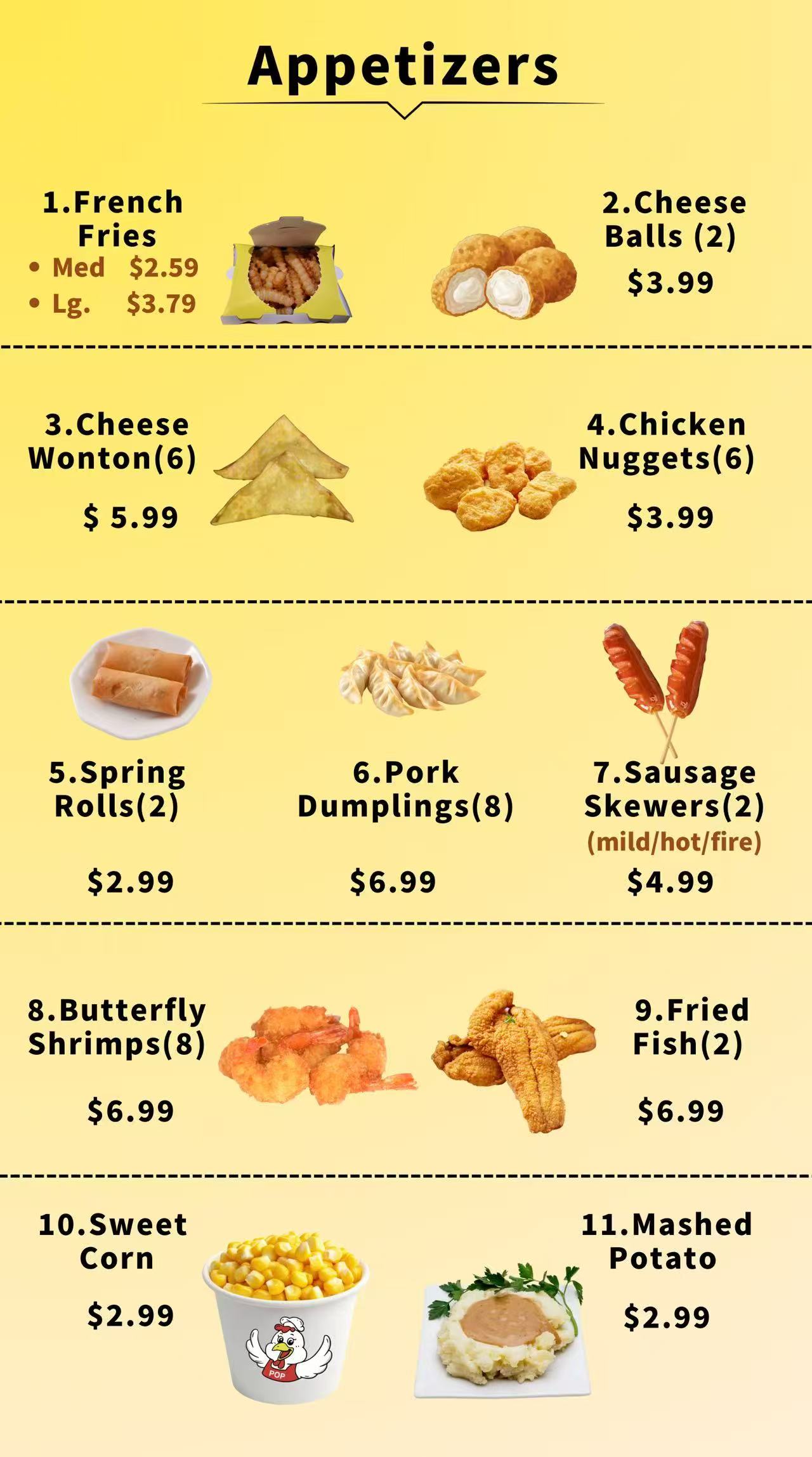
This image is an official combo meals menu board from Pop Chicken’s website (https://www.popchicken.com), part of the brand’s January 2026 content library (housed in the site’s 2026/01 asset folder). Designed to simplify meal decisions for customers seeking all-inclusive value—each combo comes with a side and a medium soft drink—the image features a structured, table-based layout that prioritizes clarity, price comparison, and customization, aligning with Pop Chicken’s casual, customer-centric dining identity.
The overall aesthetic is functional yet polished: a clean, neutral background eliminates distractions, while bold section headings and a tabular format ensure information is scannable across devices (desktop, mobile, or in-store displays). The menu uses consistent typography—dark, legible text with clear spacing—to separate meal options, side categories, and pricing tiers, making it easy for customers to quickly evaluate choices without sifting through cluttered details. A minor typographical quirk (“毛”) appears at the bottom, likely a formatting error, but it does not obscure the menu’s core information.
At the very top of the menu, a prominent header sets customer expectations upfront: “Combo Meals (Comes w/ a Side & Med. Soft Drink)”. This clear value statement immediately communicates the “all-in-one” benefit of the offerings—no need to add extra sides or drinks separately—appealing to time-pressed diners or those seeking straightforward, cost-effective meals.
The heart of the menu is a four-column table that organizes 7 combo choices, with columns for item number, meal description, “Classic Side” pricing, and “Premium Side” pricing. This layout allows for instant price comparison between side tiers while detailing each combo’s key features:
| Item # | Combo Description | Classic Side Price | Premium Side Price |
|---|---|---|---|
| 1 | CHICKEN SANDWICH • Crispy • Spicy • New Orleans Style | $8.29 | $11.29 |
| 2 | 5PC KOREAN WINGS <Bone In / Boneless> • 1 Flavor Option | $8.99 | $11.99 |
| 3 | 5PC CRISPY WINGS | $8.99 | $11.99 |
| 4 | 2PC FRIED FISH | $9.99 | $12.99 |
| 5 | 3PC DRUMSTICKS • Crispy • Spicy | $8.99 | $11.99 |
| 6 | 3PC CHICKEN TENDERS | $9.99 | $12.99 |
| 7 | 6PC CHICKEN BUCKET • Crispy • Spicy | $14.99 | $17.99 |
Key details in the descriptions are emphasized to guide choices:
- Flavor/preparation options (e.g., “Crispy • Spicy • New Orleans Style” for the sandwich)
- Customization (e.g., “<Bone In / Boneless>” for Korean Wings, “1 Flavor Option” to reference the brand’s existing sauce lineup)
- Quantity clarity (e.g., 5PC, 3PC, 6PC) to set portion expectations.
Pricing tiers are consistent and intuitive: Classic Side combos range from $8.29 (most affordable) to $14.99 (largest portion, 6PC bucket), while Premium Side upgrades add a fixed $3 surcharge across all combos ($8.29 → $11.29, $14.99 → $17.99), simplifying cost calculations for customers.
Beneath the table, two clearly labeled sections outline the side choices for each tier, ensuring no ambiguity about what “Classic” or “Premium” includes:
A bullet-point list lists 5 straightforward, crowd-pleasing sides:
- French Fries
- Mashed Potatoes
- Sweet Corn
- Spring Rolls (2 pc)
- White Rice
These options cater to classic comfort food preferences and pair universally with Pop Chicken’s savory main dishes.
Another bullet-point list highlights 6 elevated sides, all centered on fried rice (a hearty, filling upgrade), plus a special add-on note:
- Vegetable Fried Rice
- Chicken Fried Rice
- Beef Fried Rice
- Sausage Fried Rice
- Shrimp Fried Rice
- +$1 House Fried Rice (a premium-plus option for an extra dollar)
The focus on fried rice differentiates the Premium tier as more substantial and flavor-forward, while the $1 upcharge for “House Fried Rice” adds a subtle layer of customization for diners willing to splurge slightly.
Every element of the menu serves Pop Chicken’s positioning as a convenient, value-driven casual eatery:
- The “combo + side + drink” structure eliminates decision fatigue, ideal for quick lunches, dinners, or on-the-go orders.
- Clear pricing and portion details build trust (no hidden fees or vague descriptions).
- The mix of classic and premium sides caters to diverse budgets and tastes—from diners seeking simplicity to those wanting a more indulgent meal.
- The table format and bullet points keep the design uncluttered, reflecting the brand’s “no-fuss” identity.
Overall, the image functions as both an informative menu and a sales tool: it highlights value, simplifies choices, and showcases the brand’s range of offerings—from sandwiches and wings to buckets—all while maintaining the approachable, customer-friendly vibe that defines Pop Chicken.
*Prices are subject to change without notice due to market fluctuations. The prices listed on this menu may differ from in-restaurant pricing.*
Day
Hours
Sunday-Monday
11:00 AM - 10:00 PM
Tuesday
Closed
Wednesday-Thursday
11:00 AM - 10:00 PM
Friday-Saturday
11:00 AM - 10:30 PM